ITAP 5 Principles of Visual
Communication
Principle 1 legibility
The white Mazda 2 advert was
featured in this ITAP lecture, as part of the tone of voice principle, however
it could have easily been incorporated under this principle as an example of
poor work.

The most obvious defect being the strap line, which
suffers poor legibility due to the light green font on a grey back ground which
is further degraded by the glare from the cars headlights. Unless you are familiar with Mazda’s Zoom
Zoom theme, you might think you are looking at a Zoom ZC model, due to the
cropping to the right hand side of the image.
The image seems to lack balance and has a discordant
feel to it, with unsympathetic angles and doggy Photoshoping of the green light
and of the cars windows, all distract from the principle feature, the car its
self. This raises the issue of context, why is the car in a car park? As a back
drop, it detracts from the car in stead of enhancing it, and affords poor contrast
opportunities. Looking at the poorly legible strap line again “fit and sporty.
seeks same, for fun days out, maybe more.” Could this be a reference to dogging
and the doggy Photoshopping of the windows is to represent misted up windows of
two lonely hearts being united! The best way to describe this image is confused
an ill-conceived.

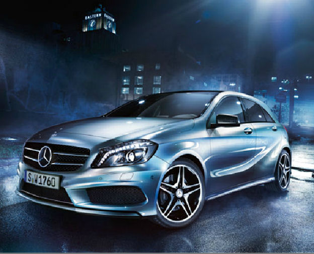
By contrast the image of the Mazda 2 from the Mazda
website has a much clearer higherarky, with the car being the star of the show.
This is emphasized by the back drop being cloned from colours of the car
itself. Due to the subtle yet perfect lighting that generates enough contrast
to make the car standout and eliminates a distraction of a background thus enhances
the car further.
The lighting and camera angle are both well
considered and work in tandem. The lighting emphasize the cars contours of the
bodywork and at the same time graduates to leave a much darker area around the
perimeter of the car that offers a contrast to the background.
The zoom zoom has been separated from the model
information and has a more distinctive wallpaper treatment while having a
more subtle presence, which is linked to the brand not the model. The main text
is simple and well contrasted letting the image of the car tell the larger part
of the story.
Principle 3 Researching the
Practice
Mazda, being a major car
manufacturer, would have keen eye on what the competition is producing on their
websites. Looking at the other car manufactures sites and lots of car imagery,
there appears to be similar lighting effects that have been used on highend
car images, but outside of grey / black no one has set the background colour from the
colour of the cars featured. This gives them a point of difference and a fresh
appearance to there imagery.

No comments:
Post a Comment